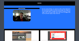
Posts

Showing posts from 2017

New Index Page 2017

Image
In the projects leading up to this big comprehensive project we learned about how to get color for a page, How to add depth to a page, and how to incorporate google web fonts into a page. I added color by using the gray and blues from the background image and the picture of myself. I added depth with the use of Wrapping and ribbons on the header and by having a large 3d background image. I used google web fonts for the font on the .logo and on the links to my blogger and word press blogs at the bottom of my index page. Check it our for yourself Here!

TV25 Website

Image
TV25 Website Process I started by creating the page itself by using a bootstrap template. However the template that i chose did not have the carousel that i wanted to i manually inserted it and added a couple of pictures of the area that TV25 covers. I used a couple different images and made them into links to act as buttons to link to TV25's Social media's and their contact information. This is displayed on every page. I also added the dropdown menus and links to the other pages into the navbar After that i duplicated the home page 4 times and started making the How To Watch page. This page explains how to set up the antenna and connect it to your tv in order to receive TV25. I also embedded the video that they have on their youtube channel into this page, like their current site i determined that for the amount of content it was better to center allign text especially for the next page. This Page is for the FAQ the content is separated into Questi

Logo Mock-Ups

Image
Some cool mock-ups of my final logo!

Elmer's Electric Logo Colorized

Image
These are the colorized versions of the final logos i decided to go with. I experimented by adding a few different shades into the mix for example i added that brownish gray to the blue one and for the red one there is a very dark blue serving as the background and as a color for the text. In the end i also added a outer glow effect to the lightning bolt. I personally love the These are what i started with.  I originally got myself down to these 2 styles of the logo one with a wired lightning bolt in the back and another with wired text and a full lightning bolt in the front. I Chose the electric blue because lightning is generally blue. I chose the yellow because thats what most people associate with electricity, And i chose the red because it resembles the red on the "Danger high voltage Sign". I eventually decided to scrap the yellow because it was contrasting a bit too much.

Revised Elmer's Electric Logo

Image
Based on feedback i was given i was told that it was hard to see the E's when they had the lightning bolt over them so i tried a few different things to get around this. I started by just moving the lightning bolt to the back which i personally think looks good. Next i tried making the E's white on a black background to give more contrast. Then i tried combining these two methods and the end result is the logo in the bottom right. However i like the middle left one as well.

Elmer's Electric Logos

Image
on this art board i tried out a bunch of different shapes for the e's and experimented with many different fonts. On this art board i selected which shape i liked ( the circle) and tried out a different font to make it relatable to the companies theme ( Elmer's Electric) I then decided to make a lightning bolt going through the E's which i like the look of. Here i tried combining the logo with a font and changing the stroke to fit the size to match the fonts size.

Wordpress.com VS Wordpress.org

Image
Wordpress.com VS Wordpress.org Wordpress.com WordPress   i s an online, open source website creation tool written in PHP. But in non-geek speak, it's probably the easiest and most powerful blogging and website content management system in existence today. Wordpress.com is distinguishable from wordpress.org because wordpress.com is fully hosted by word-press. However there are many differences between the two. For example .com has limited theme options for your website/blog/store etc. No plugins can be used. It has limited storage. Wordpress.com is free to use however there are ads but these ads can be removed by paying. You have little control. For hobby bloggers, dabblers, and beginners Wordpress.org Wordpress.org is close to the same thing as wordpress.com. However wordpress.org came first and is self-hosted meaning that you ( the one with the website) is hosting the site on your own network as opposed to the site just doing it for you. It has full theme cust

Research: Embedded maps

Image
Sites A. Zillow.com B. Wallmart.com C. Bestbuy.com How map feature was created A. Embedded Bing maps, javascript, css, pop ups <head id> <div> <wrapper> B. Embedded Google maps, Same as zillow but it links to store info C. Embedded Bing maps, Cycles through a list with pre-set animation when store pin is clicked on. Zillow (A) I think that option A. The way that zillow.com did their map is the best fit for our clients needs however, I am not sure that it will be very easy for the client to maintain. However option B may be easier to maintain due to it not popping up an entire page, Instead it just loads a separate box on the side with a picture and some text for information. Personally i think using option B will be the most simple but even then i am not entirely sure how that works. Wallmart (B) BestBuy (C)

End Of Year Reflection - Web Design

Image
Exploring Web Design Technology The majority of the technological things that we learned in web design were through detailed videos or pdfs explaining new content. Technology is important due to its ability to allow us to create websites. Along the way i started out with a few challenges. The biggest being i was not used to the Apple OS which made it very difficult to get started. Collaboration The majority of exploring web design consisted of solo project. Therefore there was not much need for any major collaboration. However i have still helped my neighbors in any way i can and vice versa. Collaboration is important because it allows us to help each other and to share ideas. Two heads are better than one! Naturally due to my introverted personality other people are a problem and thats why I am grateful that we did not have any group projects. Communication Again the majority of web design consisted of solo work/projects meaning communication was limited and most of the

End Of Year Reflection - Animation

Image
Technology Through the course of this short year i learned many things in animation such as special effects, green screening and 3d modeling. The class learned these things through the use of the VERY helpful google docs files given to us by Mr. especially. These skills, especially  green screening could be potentially very useful to me in the following years if i do not like the background of a image with green screening i could change that. Along the way i faced many challenges however the greatest challenge i faced was issues with matte-ing in after effects for special effects. Each project would take a week to complete but i always felt that i could do something more if i just had the time ( i felt rushed). Collaboration Through the course of this year i learned a fairly large amount of collaboration. Mostly through helping my neighbors with things and my neighbors helping me back with other things. This is important because it can allow me to gain more information through o

Professional Article Review - The science behind green screen

http://www.techradar.com/news/video/the-science-behind-green-screen-1301075 In this article the author Nick Broughall teaches the reader about the science of green screens. The computer program simply replaces the uncommon green color with a different background of the editors choice. However the biggest problem with this is to ensure that the actual base footage doesn't have any lighting error or too intense shadows that could cause problems for the editing process. The author argues that avoiding intense shadows is the number 1 problem that green screening faces. His evidence is that obviously when there is a shadow it changes the uncommon green background color that is used for green screening. The author's main point is that green screening is one of the largest technological advances to happen to the film industry.  His argument however does not support this main idea. I am going into web design next year however even so this information could be useful to me if i

Personal Blog Post - Snowflakes

Image
Snowflake Project The main idea of this project was to create 6 snowflakes and animate them to give them a falling effect past a window. First we had to create 6 original snowflakes through the use of the create polygon tool, and special duplication. Next we gave the snowflakes depth and texture so it looked like a actual snowflake as opposed to the flat shape that it was before. Next we created a window scene for the snowflakes to fall behind. In the process of doing so i learned how to bevel in maya. If i were to do this project again i think i would vary the snowflakes more and make them less alike to each other. Every snowflake is different after all. In conclusion i feel that this project was very interesting because we started from the smallest part and added extreme detail and put it on a bigger scale and i think it turned out good.

Technical Tutorial - Earthquake in After Effects

Image
First Create a new composition in After Effects ( Composition>New Composition) and name it whatever you like, for the purpose of this technical tutorial mine will just be called earthquake. Next right click on the very left side in the project window and do (Import>File) and select your video that you want to earthquake-ize. Now drag the video into the composition below. Depending on the size of your video you may want to scale the video up to the size of the board or you may want to decrease the size of the board to fit the video. Next we are going to fix the video so that the edges are not visible when it will shake. Select your video in the composition then go to (Effect>Stylize>motion tile) a menu will pop up where the project menu was and it will look like the image to the left of this paragraph. Change the output width and output height to 150 instead of 100 and select Mirror Edges. This will insure that the background will not be shown when the vide

Professional Project - Digital idea Showreel 2016

Image
This is a showing of how and why special affects are used in various asian movies ( specifically Korean i think). In this video the special effects are layered on and off to show how they are made. Either through an actual person and a green screen or with the use of 3d models. Some of the things we have already learned that have been displayed in this project are the use of mattes to layer objects into the right places. In general i feel that this video shows a good representation of how hollywood (or the Korean version of hollywood) uses VFX to create very realistic scenes to entice the audience.

Rebranding ONW ( Color )

Image
After further work on the zonkey logo i have ended up with this color scheme. I chose the grey to represent modern  accomplishment  and the green to represent kindness and compassion. Both of which i feel represent northwest and its students.

Rebranding ONW (work in progress)

Image
I chose the Zonkey ( a hybrid between a zebra and a donkey ) because it is quirky and most people do not know that it exists. I also chose the Zonkey because it represents northwest through its traits. It is elegant and free like a zebra but strong and endurable like a donkey. I have been having trouble with stroke sizes during this portion and i feel that this still needs ALOT of work to be even close. I would like to add a body of some kind so its not just a protruding head but that may not accomplishable. I also think that i need to add more stripes, What do you think? 

New index site!

Image
Using the pre-built templates available in dream weaver made making the layout of the website so much easier due to myself only having to customize the colors of the css and to insert the actual content. Using the template i could have a more organized site with multiple thumbnail links for projects instead of just the text links in the previous website. This makes the website more interactive. However using a template does come with its own downsides. The pre-built layout makes it kind of hard to customize to your own personal wants. But thats okay because the template works for what i need it to do. Pro web designers probably take on multiple projects at once making it close to impossible for each of them to be made from scratch. I think that they make one layout that they themselves use and then just customize it to fit the needs of the website. As usual there is a link to my index page in the side bar of this blog!

Past Present Future Site Summary

We started in photoshop by making the over and start layers for the rollovers that we used for this project. The main goal of this project was to create a website talking about our personal past presents and futures by using rollovers and a set inner bottom div to put said content in. I personally think i did a pretty good job on this project however if i were to do it again i would go back and change the content on the pages themselves. I felt they were pretty barren or empty. I enjoyed this project it was simple yet it was challenging and fun to create the images that were used for the layout of the website. Heres a link to my index page so you can check out this project and many others for yourself: Here

Plausible Impossible

Image
Plausible Impossible  If called to do so by their king the playing cards also act as soldiers, In doing so the cards will run with their very own legs this is impossible in our reality due to the fact that playing cards are not living beings and therefore don't have moving legs. However this is plausible due to Mickey having travelled through the mirror into another reality where common household objects are sentient beings. When Mickey eats the nut that was cracked by the nutcracker he grows to the size of the house almost breaking the roof and then immediately shrinks to the size of a playing card. This is impossible due to the laws of nature in our own world, and even more so these things could not happen from eating a ordinary nut. However this is plausible because as walt disney said at the beginning of the clip "in this world the laws of nature were suspended". Whilst being chased by the army of playing cards Mickey stumbles upon a fountain pen. W

Photo composition Responsive website!

Image
What is responsive design? Responsive design is web design for any device that is not a desktop, so for example phones, tablets, small laptops, etc. Responsive design is so important these days due to the larger amount of people that are accessing the internet via their phones and tablets. For mobile sizes the CSS sizes must be changed to percentages so that they can re-adjust to the size of the screen, this is also provided by using media queries.  Here is a link to the site: Responsive Photo Composition site! Before:                                                                                                           After: Ipad:                                                                                Desktop:

Responsive Web Design

Image
Responsive Web Design What is responsive web design? Responsive Web design  is the approach that suggests that  design  and development should respond to the user's behavior and environment based on screen size, platform and orientation. The practice consists of a mix of flexible grids and layouts, images and an intelligent use of CSS media. Why is it so important? Responsive Web design is important today due to the VERY large amount of people that are accessing the internet using something other than a computer, such as phones,tablets,etc. Anything that doesn't have the same screen size as a regular computer is subject into the category of responsive design. What are media queries? A Media query is a CSS technique introduced in CSS3. It uses the @media rule to include a block of CSS properties only if a certain condition is true. If this certain condition is met it allows the website to change its appearance.  What are Breakpoints? Breakpoints  are th

Flash

Image
Before and with flash before the age of flash, the internet and websites were a barren wasteland of black and white ( or even just a single monochromatic color) text and nothing but that. with the introduction of flash in the late 90's websites became more vibrant had more moving parts and more interactive pieces. flash guaranteed that the content that was being displayed would look like and behave the same way for anyone on any operating system and in any browser that saw it. Apple However with anything on the internet it will eventually fall or become obsolete. This happened for flash in 2007 when Apple decided not to support flash on their newly introduced IPhone. Around this time HTML5 was starting to emerge and that would be supported instead of the highly loved at the time flash. Flash before this was at its peak. it had been used to create many a interactive website and games that were played by many people every single day. The downfall in 2011 adobe acknowle