Posts

Showing posts from September, 2015

Photoshop project 1

Image
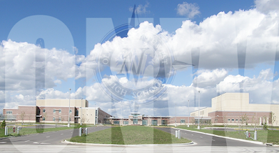
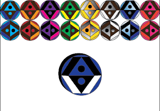
This was our first photoshop project. we combined 2 images into one and then edited it. we started by formating the image of our school and the compass logo to the correct size about 40 percent and 20 percent. then we combined them into one image puting the compass in the middle of the image of our school. then we changed the opacity of the compass to fade into the background. then i added the letters ONW in impact 360 font, white text to the image  and stretched it out to fill the page. then changed the opacity of the letters to make it fade into the background creating a single image made out of many diffrent parts i hope to have more fun creating and editing things in photoshop in projects to come.

Personal Logo

Image
This is my personal logo. i started by taking the fundamentals we learned about and making more basic shapes that fit into them. i ended up with a contrasting colors kind of diamond. i then tried copying them and trying out diffrent colors i liked the blue and black the most. i then tried making it sideways from the original away. i liked the original the most. i found that this shows symmetry and balance making it a perfect simple yet says some things about me kind of logo. i started with a circle as a base because it simply shows perfection and unity making it a great way to show symetry and balance. i would definatly make more logos and designs with a base as a circle

Anatomy of a font

Image
The score of this project was to learn the anatomy of a font and apply it to the font that we got from the test that everyone took. First i started by Typing my name in the dot matrix font and sizing it to about 200 font size. i then copied the font and moved it to create a shadow. i then labeled the spur, terminal,aperture,bowl,and tails respectively on the font. I learned that there is many cool things that you can do with fonts especially in illustrator.i would've done more than my name if i had done something diffrent. if i did something the same i would make the shadow again because i feel it adds depth. that i can make shadows of things in illustrator by duplicating it and making it black and moving one of them to the front and forward a bit.i feel this was a very fun and creative project that showed that art and graphic design doesn't just have to be shapes it can be letters too

What is graphic design

Image
What is graphic design Graphic design is a digital art form. creating logos and other kinds of digital art i feel is very interesting. i Love art in middle school i took it all 3 years i enjoyed it very much but i felt that something was missing. I also very much loved working on the computer i spent most of my spare time now and days playing games and whatching  youtube videos so why not combine those two things i love into one.

Color wheel

Image
Better color wheel. I Created this Color wheel by cloning a elipse then using the rotate tool to rotate the coned elipse into diffrent positions i then colored each elipse a primary secondary or tertiary colors this uses the colors of the color wheel and i feel that the spiral creates some of motion so your eyes can follow around it easily