Posts

Web Hosting

Image
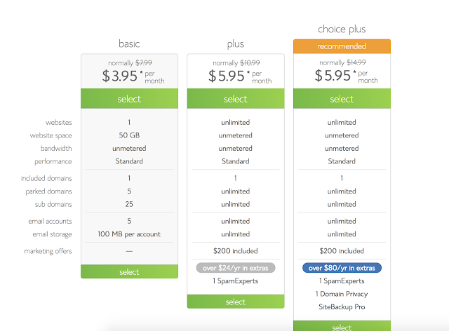
1.      Bluehost, Hostgator, iPage were the best sites that i found 2.      Bluehost specializes in wordpress. 3.      I like Bluehost the most, Because it has a money back guarantee if you dislike it and comes with a free SSL certificate 4. Personally i would choose the basic as i have no need for unlimited websites and space, as websites don't take up that much space. 

ABOUT ME Reflection

Image
1.  What i love the most about web design is about how individual it is, Being able to rely on only yourself. This allows myself to control the quality of a project without interfering with others plans. Collaboration on the other hand is a very useful tool that can be used as necessary.  2. 3.  I have experiences in: Html, Css, Responsive Design, Wordpress, Bootstrap, Javascript, PHP, Databases, Flash Web Animation, and Photoshop Animation. 4.   Check out these cool 2018 websites.  Mikiya Kobayashi  Dropbox Design  5.  We've mainly used Dreamweaver, Photoshop, Illustrator, and Wordpress.  6.  Last year we messed around a bit in Javascript but it didn't go very deep. I would like to go deeper into javascript. I would also like to learn more about Wordpress because we didn't have the greatest time with the free versions. 

End of Year Reflection - Web 2018

Image
Reflection 2018 This year in Web Design has been spent forming deeper relationships with not only the other Juniors, but also with the seniors and Mr. Olson who are leaving.  Through these relationships i have learned many things from Technical skills to leadership over the length of this year in e-Communication.  Technology Ive learned so many new technical skills this year. More HTML, More CSS, Wordpress, PHP, Parallaxes, Greater general design skills, and even some Javascript. A good example of these new HTML and CSS skills in action would be my entry to e-Magine this year. I created a website from scratch over how to more effectively learn a language. I also created the background to this website myself by putting together the home countries of the worlds most spoken languages.  Technological skills are very important in the realm of web design because, it allows you to channel the design aspects into something that works correctly. For this Project ...

EXTREME!! Homepage Makeover

Image
Olathe North High School,Olathe KS. https://schools.olatheschools.com/buildings/north/ Cheez-It, Cheesy snacks. https://www.cheezit.com/en_US/home.html?gclid=Cj0KCQjwttbWBRDyARIsAN8zhbIbGFv3aT26z7oS0VzXo0KMlyC8sKDu0uqmajUhjpSumQMtL9WyYN8aAjhJEALw_wcB

Smitty's Lawn & Garden Mobile First

Image
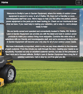
 This is a site about Smitty's Lawn & Garden equipment. The objective of this site was to demonstrate how to properly use Mobile-first web design and to apply it by using it to create a Mobile-first re-design of the original Smitty's site ( Just the homepage for now ). What it means to be Mobile-first is exactly what it sounds like, Start with the small mobile sized and then gradually work your way up to the desktop size.  Before i started working on the actual site, I wrote down all of the essential information and motives on the Actual Smitty's lawn and garden homepage. Next i sketched a rough estimate of what i imagined the Mobile-first site would look like. Now that i had moved onto dreamweaver, I started with the Navbar in mobile size and slowly worked my way up to desktop size. You can check out the site for yourself Here!

CSS Zen Jabberwocky

Image
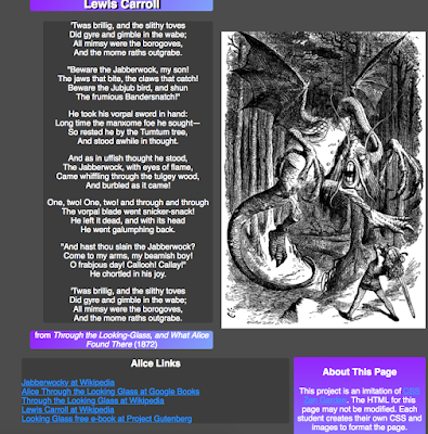
This is a website about the Jabberwock ( Jabberwocky ) a mythical beast from the world of Alice in wonderland. The goal for us for this site was to take a set HTML and use css to make the page look good using divs. I started by drawing out the layout that i wanted on a piece of paper then moved onto the actual site. I then created a special div just for the content of the poem itself. Next i changed the color scheme to be darker and use purple and lighter blues as accents. I chose this because i personally like the Tim Burton's Alice in Wonderland version of the Jabberwocky more. The Tim Burton version is more dragon like and is black and purple. In my personal opinion this version of the Jabberwock is scarier and less goofy looking. Check out the site for yourself Here

New Index Page 2017

Image
In the projects leading up to this big comprehensive project we learned about how to get color for a page, How to add depth to a page, and how to incorporate google web fonts into a page. I added color by using the gray and blues from the background image and the picture of myself. I added depth with the use of Wrapping and ribbons on the header and by having a large 3d background image. I used google web fonts for the font on the .logo and on the links to my blogger and word press blogs at the bottom of my index page. Check it our for yourself Here!