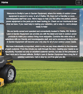
This is a site about Smitty's Lawn & Garden equipment. The objective of this site was to demonstrate how to properly use Mobile-first web design and to apply it by using it to create a Mobile-first re-design of the original Smitty's site ( Just the homepage for now ). What it means to be Mobile-first is exactly what it sounds like, Start with the small mobile sized and then gradually work your way up to the desktop size. Before i started working on the actual site, I wrote down all of the essential information and motives on the Actual Smitty's lawn and garden homepage. Next i sketched a rough estimate of what i imagined the Mobile-first site would look like. Now that i had moved onto dreamweaver, I started with the Navbar in mobile size and slowly worked my way up to desktop size. You can check out the site for yourself Here!


