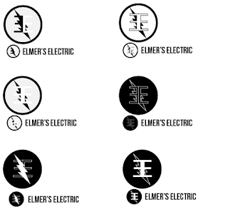
Revised Elmer's Electric Logo
Based on feedback i was given i was told that it was hard to see the E's when they had the lightning bolt over them so i tried a few different things to get around this. I started by just moving the lightning bolt to the back which i personally think looks good. Next i tried making the E's white on a black background to give more contrast. Then i tried combining these two methods and the end result is the logo in the bottom right. However i like the middle left one as well.


Comments
Post a Comment