Posts

Web Hosting

Image
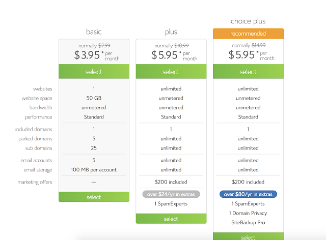
1.      Bluehost, Hostgator, iPage were the best sites that i found 2.      Bluehost specializes in wordpress. 3.      I like Bluehost the most, Because it has a money back guarantee if you dislike it and comes with a free SSL certificate 4. Personally i would choose the basic as i have no need for unlimited websites and space, as websites don't take up that much space. 

ABOUT ME Reflection

Image
1.  What i love the most about web design is about how individual it is, Being able to rely on only yourself. This allows myself to control the quality of a project without interfering with others plans. Collaboration on the other hand is a very useful tool that can be used as necessary.  2. 3.  I have experiences in: Html, Css, Responsive Design, Wordpress, Bootstrap, Javascript, PHP, Databases, Flash Web Animation, and Photoshop Animation. 4.   Check out these cool 2018 websites.  Mikiya Kobayashi  Dropbox Design  5.  We've mainly used Dreamweaver, Photoshop, Illustrator, and Wordpress.  6.  Last year we messed around a bit in Javascript but it didn't go very deep. I would like to go deeper into javascript. I would also like to learn more about Wordpress because we didn't have the greatest time with the free versions. 

End of Year Reflection - Web 2018

Image
Reflection 2018 This year in Web Design has been spent forming deeper relationships with not only the other Juniors, but also with the seniors and Mr. Olson who are leaving.  Through these relationships i have learned many things from Technical skills to leadership over the length of this year in e-Communication.  Technology Ive learned so many new technical skills this year. More HTML, More CSS, Wordpress, PHP, Parallaxes, Greater general design skills, and even some Javascript. A good example of these new HTML and CSS skills in action would be my entry to e-Magine this year. I created a website from scratch over how to more effectively learn a language. I also created the background to this website myself by putting together the home countries of the worlds most spoken languages.  Technological skills are very important in the realm of web design because, it allows you to channel the design aspects into something that works correctly. For this Project ...

EXTREME!! Homepage Makeover

Image
Olathe North High School,Olathe KS. https://schools.olatheschools.com/buildings/north/ Cheez-It, Cheesy snacks. https://www.cheezit.com/en_US/home.html?gclid=Cj0KCQjwttbWBRDyARIsAN8zhbIbGFv3aT26z7oS0VzXo0KMlyC8sKDu0uqmajUhjpSumQMtL9WyYN8aAjhJEALw_wcB

Smitty's Lawn & Garden Mobile First

Image
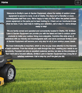
 This is a site about Smitty's Lawn & Garden equipment. The objective of this site was to demonstrate how to properly use Mobile-first web design and to apply it by using it to create a Mobile-first re-design of the original Smitty's site ( Just the homepage for now ). What it means to be Mobile-first is exactly what it sounds like, Start with the small mobile sized and then gradually work your way up to the desktop size.  Before i started working on the actual site, I wrote down all of the essential information and motives on the Actual Smitty's lawn and garden homepage. Next i sketched a rough estimate of what i imagined the Mobile-first site would look like. Now that i had moved onto dreamweaver, I started with the Navbar in mobile size and slowly worked my way up to desktop size. You can check out the site for yourself Here!

CSS Zen Jabberwocky

Image
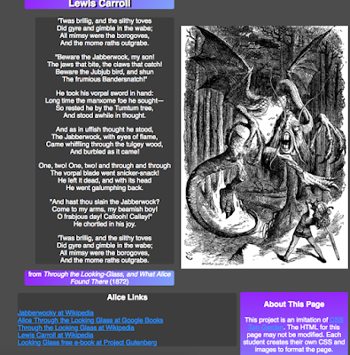
This is a website about the Jabberwock ( Jabberwocky ) a mythical beast from the world of Alice in wonderland. The goal for us for this site was to take a set HTML and use css to make the page look good using divs. I started by drawing out the layout that i wanted on a piece of paper then moved onto the actual site. I then created a special div just for the content of the poem itself. Next i changed the color scheme to be darker and use purple and lighter blues as accents. I chose this because i personally like the Tim Burton's Alice in Wonderland version of the Jabberwocky more. The Tim Burton version is more dragon like and is black and purple. In my personal opinion this version of the Jabberwock is scarier and less goofy looking. Check out the site for yourself Here

New Index Page 2017

Image
In the projects leading up to this big comprehensive project we learned about how to get color for a page, How to add depth to a page, and how to incorporate google web fonts into a page. I added color by using the gray and blues from the background image and the picture of myself. I added depth with the use of Wrapping and ribbons on the header and by having a large 3d background image. I used google web fonts for the font on the .logo and on the links to my blogger and word press blogs at the bottom of my index page. Check it our for yourself Here!

TV25 Website

Image
TV25 Website Process I started by creating the page itself by using a bootstrap template. However the template that i chose did not have the carousel that i wanted to i manually inserted it and added a couple of pictures of the area that TV25 covers. I used a couple different images and made them into links to act as buttons to link to TV25's Social media's and their contact information. This is displayed on every page. I also added the dropdown menus and links to the other pages into the navbar After that i duplicated the home page 4 times and started making the How To Watch page. This page explains how to set up the antenna and connect it to your tv in order to receive TV25. I also embedded the video that they have on their youtube channel into this page, like their current site i determined that for the amount of content it was better to center allign text especially for the next page. This Page is for the FAQ the content is separated into Questi...

Logo Mock-Ups

Image
Some cool mock-ups of my final logo!

Elmer's Electric Logo Colorized

Image
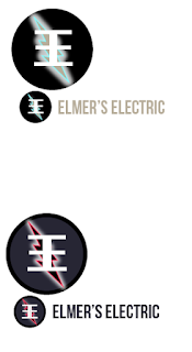
These are the colorized versions of the final logos i decided to go with. I experimented by adding a few different shades into the mix for example i added that brownish gray to the blue one and for the red one there is a very dark blue serving as the background and as a color for the text. In the end i also added a outer glow effect to the lightning bolt. I personally love the These are what i started with.  I originally got myself down to these 2 styles of the logo one with a wired lightning bolt in the back and another with wired text and a full lightning bolt in the front. I Chose the electric blue because lightning is generally blue. I chose the yellow because thats what most people associate with electricity, And i chose the red because it resembles the red on the "Danger high voltage Sign". I eventually decided to scrap the yellow because it was contrasting a bit too much.

Revised Elmer's Electric Logo

Image
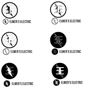
Based on feedback i was given i was told that it was hard to see the E's when they had the lightning bolt over them so i tried a few different things to get around this. I started by just moving the lightning bolt to the back which i personally think looks good. Next i tried making the E's white on a black background to give more contrast. Then i tried combining these two methods and the end result is the logo in the bottom right. However i like the middle left one as well.

Elmer's Electric Logos

Image
on this art board i tried out a bunch of different shapes for the e's and experimented with many different fonts. On this art board i selected which shape i liked ( the circle) and tried out a different font to make it relatable to the companies theme ( Elmer's Electric) I then decided to make a lightning bolt going through the E's which i like the look of. Here i tried combining the logo with a font and changing the stroke to fit the size to match the fonts size.

Wordpress.com VS Wordpress.org

Image
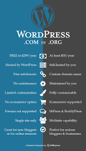
Wordpress.com VS Wordpress.org Wordpress.com WordPress   i s an online, open source website creation tool written in PHP. But in non-geek speak, it's probably the easiest and most powerful blogging and website content management system in existence today. Wordpress.com is distinguishable from wordpress.org because wordpress.com is fully hosted by word-press. However there are many differences between the two. For example .com has limited theme options for your website/blog/store etc. No plugins can be used. It has limited storage. Wordpress.com is free to use however there are ads but these ads can be removed by paying. You have little control. For hobby bloggers, dabblers, and beginners Wordpress.org Wordpress.org is close to the same thing as wordpress.com. However wordpress.org came first and is self-hosted meaning that you ( the one with the website) is hosting the site on your own network as opposed to the site just doing it for you. It has full theme...

Research: Embedded maps

Image
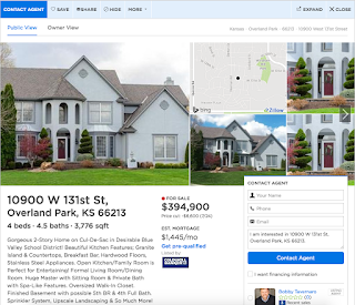
Sites A. Zillow.com B. Wallmart.com C. Bestbuy.com How map feature was created A. Embedded Bing maps, javascript, css, pop ups <head id> <div> <wrapper> B. Embedded Google maps, Same as zillow but it links to store info C. Embedded Bing maps, Cycles through a list with pre-set animation when store pin is clicked on. Zillow (A) I think that option A. The way that zillow.com did their map is the best fit for our clients needs however, I am not sure that it will be very easy for the client to maintain. However option B may be easier to maintain due to it not popping up an entire page, Instead it just loads a separate box on the side with a picture and some text for information. Personally i think using option B will be the most simple but even then i am not entirely sure how that works. Wallmart (B) BestBuy (C)

End Of Year Reflection - Web Design

Image
Exploring Web Design Technology The majority of the technological things that we learned in web design were through detailed videos or pdfs explaining new content. Technology is important due to its ability to allow us to create websites. Along the way i started out with a few challenges. The biggest being i was not used to the Apple OS which made it very difficult to get started. Collaboration The majority of exploring web design consisted of solo project. Therefore there was not much need for any major collaboration. However i have still helped my neighbors in any way i can and vice versa. Collaboration is important because it allows us to help each other and to share ideas. Two heads are better than one! Naturally due to my introverted personality other people are a problem and thats why I am grateful that we did not have any group projects. Communication Again the majority of web design consisted of solo work/projects meaning communication was limited and most of the...

End Of Year Reflection - Animation

Image
Technology Through the course of this short year i learned many things in animation such as special effects, green screening and 3d modeling. The class learned these things through the use of the VERY helpful google docs files given to us by Mr. especially. These skills, especially  green screening could be potentially very useful to me in the following years if i do not like the background of a image with green screening i could change that. Along the way i faced many challenges however the greatest challenge i faced was issues with matte-ing in after effects for special effects. Each project would take a week to complete but i always felt that i could do something more if i just had the time ( i felt rushed). Collaboration Through the course of this year i learned a fairly large amount of collaboration. Mostly through helping my neighbors with things and my neighbors helping me back with other things. This is important because it can allow me to gain more information throu...